
In the dynamic and ever-evolving landscape of web design, choosing the right approach for your website is crucial to provide an optimal user experience across various devices. Two prevalent strategies in this realm are responsive and adaptive web design. In this article, we will delve into the intricacies of these approaches, exploring their differences, advantages, and potential drawbacks to help you make an informed decision for your website.
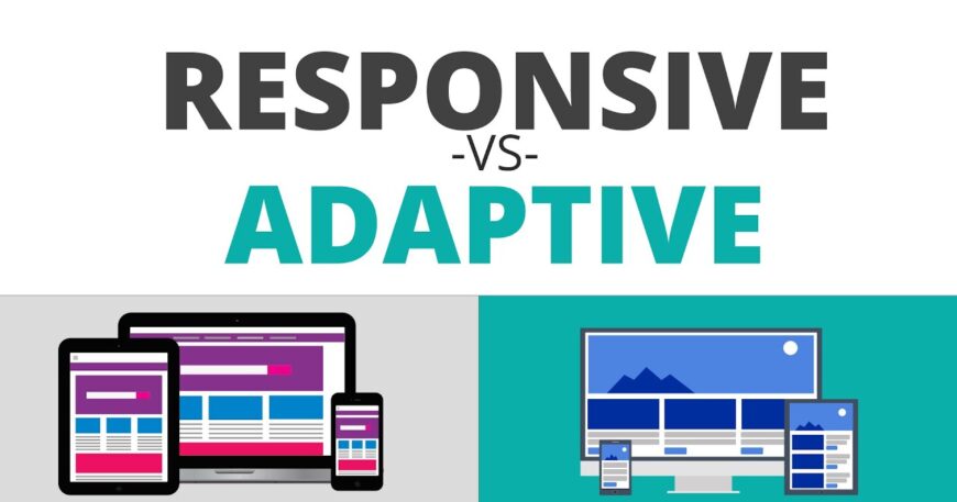
Understanding Responsive Web Design:
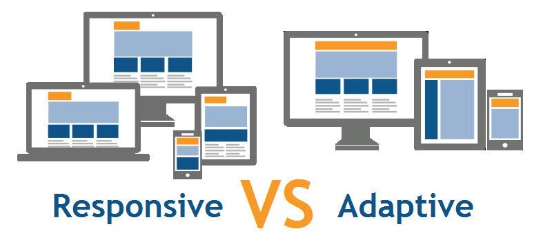
Responsive web design (RWD) is a design approach that focuses on creating a flexible and fluid layout that adjusts to different screen sizes and resolutions. The primary goal is to provide a seamless user experience regardless of the device used to access the website. This is achieved through the use of fluid grids, flexible images, and media queries.
Fluid grids enable the content to adapt proportionally to the screen size, ensuring that the layout remains consistent and visually appealing. Flexible images, on the other hand, resize dynamically to fit the available space, preventing distortion or cropping. Media queries play a pivotal role by allowing the website to apply different styles based on the characteristics of the device, such as screen width, height, and orientation.
Advantages of Responsive Web Design
Consistency Across Devices
One of the primary advantages of responsive design is its ability to maintain a consistent look and feel across a wide range of devices, from desktop computers to smartphones and tablets.
Cost-Effective
Since responsive design utilizes a single codebase for all devices, it is often more cost-effective to implement and maintain compared to building separate versions for different devices.
SEO Benefits
Google and other search engines prioritize mobile-friendly websites. Responsive design enhances a site’s mobile-friendliness, positively impacting search engine rankings and visibility.
Future-Proof
As new devices with varying screen sizes are introduced, a responsive design is inherently adaptable, making it a future-proof solution that can accommodate technological advancements.
Understanding Adaptive Web Design
Adaptive web design (AWD) takes a different approach by designing and developing multiple layouts for specific device categories. Instead of relying on a single, fluid layout, adaptive design involves creating distinct layouts for different screen sizes, such as desktops, tablets, and smartphones. The appropriate layout is then served based on the device type detected.
Adaptive design typically employs server-side components to detect and deliver the appropriate layout, making decisions before the content reaches the user’s device. This approach allows for a more tailored and optimized user experience on each device.
Advantages of Adaptive Web Design
Tailored User Experience
With adaptive design, you can create a more tailored user experience for each device, optimizing the layout and content presentation for specific screen sizes and resolutions.
Performance Optimization
Since adaptive design serves device-specific layouts, it can be more efficient in terms of performance. Unnecessary elements for a particular device can be excluded, resulting in faster loading times.
Design Precision
Designers have more control over the presentation of content on different devices, allowing for precise adjustments to enhance the visual appeal and usability for each screen size.
Better Support for Older Devices
Adaptive design can be particularly beneficial for supporting older devices or browsers that may not fully support the latest web technologies used in responsive web development.
Choosing the Right Approach
The decision between responsive and adaptive design depends on various factors, including the nature of your website, target audience, and budget constraints. Here are some considerations to help guide your decision:
Content and User Experience Goals
If your website’s content and user experience can be effectively adapted to a single layout that scales across devices, responsive design may be the more suitable choice. On the other hand, if you have specific requirements for different devices, such as a complex navigation structure for desktop users and simplified menus for mobile users, adaptive design may be more appropriate.
Budget and Resources
Responsive design is often more budget-friendly as it involves creating a single design that adapts to different devices. Adaptive design, with its multiple layouts, may require more resources and development time. Consider your budget constraints and resource availability when making a decision.
Performance Considerations
In the realm of web design, particularly when performance is a paramount concern, opting for adaptive design can yield significant advantages. The crux lies in the ability to customize layouts for specific devices, allowing for a streamlined and efficient user experience. Unlike responsive design, which necessitates loading resources for all devices regardless of their specific requirements, adaptive design selectively loads only the essential resources pertinent to each device category.
This tailored approach minimizes unnecessary data transfer and accelerates page loading times, ultimately enhancing the overall performance of the website. For organizations prioritizing a swift and responsive online presence, especially in the context of varied user devices, the performance optimization inherent in adaptive design makes it a compelling choice.
Future Growth and Technological Advancements
If you anticipate frequent updates and additions to your website, responsive design may be a more future-proof choice. It provides a scalable solution that can easily accommodate new devices without significant redevelopment efforts.
Conclusion
In the realm of web design, the choice between responsive and adaptive design is not a one-size-fits-all decision. Each approach has its own strengths and weaknesses, and the optimal choice depends on your website’s specific requirements and goals. Responsive design offers a flexible and cost-effective solution for maintaining consistency across devices, while adaptive design provides a more tailored and optimized user experience for specific device categories.
Ultimately, the key is to carefully assess your website’s content, user experience goals, budget, and performance considerations before making a decision. Whichever approach you choose, the ultimate goal is to provide users with a seamless and enjoyable experience, regardless of the device they use to access your website. As technology continues to evolve, staying informed about the latest trends and best practices in web design will be crucial to ensuring the long-term success and relevance of your online presence.

