
Responsive web design has become a crucial component of Vancouver web design in today’s mobile-first market.
More people are using smartphones and other mobile devices to access the internet. Therefore, companies must have websites that are mobile-friendly.
Responsive web design ensures that a website can adapt to different screen sizes and devices and offers a consistent user experience on all platforms.
We’ll go over the significant role that responsive web design plays in Vancouver web design and why it’s so essential for companies to prioritize it regarding their online presence.
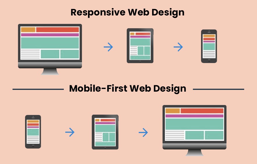
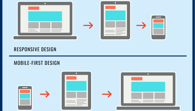
What is Responsive Web Design?
To ensure a good user experience across devices, businesses use responsive web design. Which adapts to various screen sizes, including desktop computers, tablets, and smartphones. This is accomplished by using CSS media queries, flexible grid layouts, and optimized images.
Responsive web design ensures consistency in style and content across all devices. Its primary advantage is accessibility to a broad audience, regardless of the device used, making it crucial in today’s mobile-first environment.
By prioritizing responsive web design, businesses optimize their websites for all devices and provide the best user experience to visitors.
Mobile-First Design Approach
The “mobile-first” design strategy prioritizes designing for mobile devices before desktop ones. It acknowledges mobile device usage popularity and delivers the best user experience on smaller screens with less capability.
A leaner, more streamlined website can be created by prioritizing essential features using this strategy. The ability to enhance the user experience for mobile users is one of its primary advantages.
Designing first for mobile devices ensures a faster and more seamless user experience. Prioritizing information and using responsive design methods are among its main tenets.
The mobile-first design methodology is becoming increasingly significant in Vancouver web design due to more mobile internet usage. Businesses can ensure the best user experience for all users by prioritizing mobile-first design.
Responsive web design’s Effect on SEO
Responsive site design can significantly impact search engine optimization (SEO) by making websites more mobile-friendly.
Search engines such as Google give more weight to mobile-friendly websites in their rankings. Responsive web design uses only one URL for both desktop and mobile devices. Thus eliminating the need for separate mobile versions that could harm its authority and search engine rankings.
Responsive design can also improve website load speeds on mobile devices. Which is a crucial component in search results. Optimizing photos and other content for mobile devices can enhance page performance. Additionally lower bounce rates, resulting in a positive effect on search engine results.
Additionally, responsive design can enhance the user experience, a crucial aspect for search engine rankings. It achieves this by ensuring a smooth user experience across all platforms.
Consequently, responsive design can encourage visitors to spend more time on the website and interact more with its content. Increased engagement over time may result in higher search rankings.
Best Practices for Responsive Web Design in Vancouver
There are several best practices for responsive web design in Vancouver that companies should adhere to guarantee that their websites offer the optimum user experience on all devices. Among these ideal practices are the following:
To prioritize mobile-first design, businesses should design for mobile devices first to optimize their websites for mobile consumers, which can enhance user engagement and search results.
To ensure that the website layout responds to various screen sizes and devices, use a responsive grid system to produce an intuitive and uniform user experience across all platforms.
Additionally, optimize photos and other material for mobile devices by adjusting images and content for smaller displays to reduce page load speeds. Testing the website on various devices and screen sizes is crucial to ensure it is genuinely responsive and identify places that may require modifications.
Using a responsive web design framework can make the design process simpler and more effective by providing pre-made design components and templates that can be altered to fit specific business requirements.
These best practices can help businesses ensure their websites are optimized for all devices and provide the best user experience across all platforms.
With the rise in relevance of mobile-friendly websites in search results and user engagement, responsive web development has become a crucial component of Vancouver web design.
Conclusion
In today’s mobile-first era, responsive web design plays a crucial role in modern web design. Businesses in Vancouver can enhance the user experience on all platforms. Through prioritizing mobile-first design, using a responsive grid system.
Additionally optimizing content for mobile devices, testing the website on various devices, and utilizing a responsive web design framework.
In addition to improving user engagement and satisfaction, responsive web design can benefit SEO and search engine results. With more people accessing the internet on mobile devices than ever before, responsive web design has become a vital component of successful Vancouver web design.
To remain competitive in today’s digital world, businesses must ensure their websites are well-positioned by implementing responsive design best practices.

